
Tuesday, 25 March 2014
night lighting

Saturday, 15 March 2014
Advanced Rep
Advanced Rep has been a nice experience...although presenting is always a nervous thing...I think the nerves are good, makes you care about what you are doing....The continuous presenting this year has made me more confident at work in the classroom when I am teaching.
It is quite strange the perception you have of yourself compared with what others think...It was eye opening in Mondays AD Rep lesson where, randomly picked, was the video of my presentation the previous week. I was very pleased with my performance, even if I fiddled with my ring a couple of times!!
The logo is a combination of my initials, (ether BS or RS depending on what you call me) and a graphic sunflower that was used many moons ago as the logo for previous business of mine.
The grasses in the back ground look slightly 3d and the flowers are Sanguisorba officinalis

Front of business card

Back of business card
(Shelly thought I should take my teaching qual off there but I want to keep it on)

Letter headed paper
Ready to improve?
I haven't found a real style for rendering yet so I am disappointed in my work...Although I managed to complete all the work for the crit on Monday 10.3.14 the quality was poor in my opinion. Quality or complete? that was the question....I chose to complete and had a melt down in the process!!!
Model:

This is the stuff I pinned up but I really wanted to stick notes all over it saying: (in caps)


....I KNOW THE RENDERING IS CRAP, ..People are too big in B-B
.....Stupidly I didn't put these notes on the work so had the hideous task of presenting without saying all that...if and when I am proud of the work.....presenting will be a doddle...
Model:
This is the stuff I pinned up but I really wanted to stick notes all over it saying: (in caps)
I KNOW I HAVEN'T RENDERED MY SEQUENTIAL SKETCHES PROPERLY oh and I annotated incorrectly..silly mistake at 11pm the night before.....
I KNOW THE COLOURS ARE CRAP and I KNOW THE TREES ARE NOT DONE PROPERLY ON PLAN Title blocks are too heavy and the key should be on RHS...(not the Royal Horticultural Society as I thought!)lol
....I KNOW THE RENDERING IS CRAP, ..People are too big in B-B
.....Stupidly I didn't put these notes on the work so had the hideous task of presenting without saying all that...if and when I am proud of the work.....presenting will be a doddle...
Sunday, 2 February 2014
Precedent images
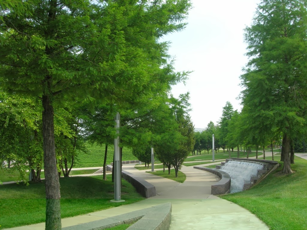
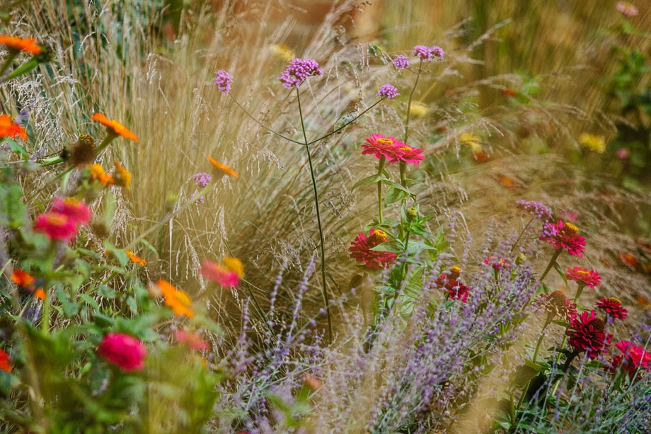
I am pleased with the images I found although Jamie said they would convey what I had in mind better if I cropped them, which I will do for tomorrow. I the mean time here are some of the short list:


Tuesday, 14 January 2014
Colour colour colour...
I was so fed up with the dullness of my sites...that my reasons for my brilliantly colourful canopy and pink walls is to brighten up my dull sites......I love colourful gardens and colour makes people happy, it is like the sun...the light reflections create a cheerful mood..and pink or...Jamie's suggestion of cerise shows the green of any plants off in a spectacular way....I am sticking to my bright pink but Dear potential client...you can have any colour you like!


lol
crit 13th Jan 2014 pre final hand in.
Pin up yesterday, amendments needed........
Plans: Key too large on plan...I think needs re-colouring too, Colour some buildings for context, why pink walls? Julia asked...because the contrast with green is intense. Canopy looks like it is plonked....may change the shape...for the better I hope...Text font and size need to change.

Sections of Mint Street:Ground line needs to be thicker and section should be whole length of A1

Sections for Crossbones:Maybe turn this section 90 degrees, I am going to re colour these and drop the backgrounds

Sketch perspectives: Pleased with these, maybe add fruiting trees, need 4 more sequences to make up a full walk through of the parks

Precedents/Mood board: Leave spaces around some pics, find out where the pictures are of....change, add maybe...still only 7 though...

Quite pleased with my feedback overall, I know what I have to do to improve, I just don't have a lot of time to do it...working tomorrow and Thursday so I only really have 3 days to do it all....arrrrgghhhh
shame as it could be so much better....
Saturday, 28 December 2013
What I have been doing since my last blog...
Although nothing uploaded on here, I have been working on my projects, albeit slow progress as I am not a whizz with the computer and my sketching skills need much more practice, I am hoping that I can achieve something to be proud of.
Sketch book ideas for naming my site....
and the content, what should be present in the park? After a lot of document reading about The London Plan, green infrastructure, green urban spaces, Bankside Open Spaces Trust, London Green Grid , GreenBay Urban tree canopy and more, I have come to the conclusion:
Definitely trees..lots of trees.... to go hand in hand with the Bankside 'Urban Forest' project and the 'RE-LEAF' plan for London. Green walls, green roof, community gardening and community space/centre, water of some kind, a place to sit, a place to eat and a space for walking and cycling through. Crossbones must have (in my mind) a memorial of some kind for the Winchester Geese. (Ladies of the night who were buried in an unconsecrated grave on the Crossbones site, and later, paupers of the area.)

 Ribbons for the dead tied to a gate at Crossbones and the green wall along the North Boundary of the site.
My Winchester Geese!

Some drawing practice for the sequential sketching....these are not pictures of my site...


This was a thumbnail quick sketch of Crossbones site looking towards the Shard, again...not actually what I intend, just a practice.

Now I must get on with the real pics for my sites...Mint Street is proving more tricky but hey ho, same for everyone.
Subscribe to:
Posts (Atom)